Graphic design revolves around visual communication, which is vitally important for our world today. Our monkey brains look for visual cues everywhere, and we have evolved to appreciate certain visual principles which can be used to attract and hold our attention. Communicating visually happens much faster than any other communication because it was developed through our evolution. Mostly due to the speeds and quantities at which we process information these days, visual communication is critical for all aspects of marketing and branding.
Graphic designers are experts in visual communication, but they also must be trained in visual semantics. Visual semantics are visual cues that society has attached a specific meaning to. This is where visual styles come from. Styles are a collection of visual attributes that have gained their own visual semantics and can communicate a specific message to viewers.
Here is an example of a poster using a Wild West visual style to convey a message.
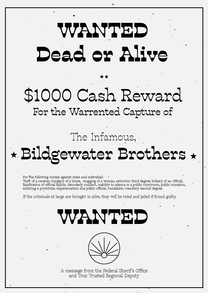
Classic, swinging, screen saloon doors and Tuscan Egyptian typefaces are immediately identifiable with the Wild West genre, mostly because the media we consume has used these visual cues consistently in this genre. Emotions and connotations associated with the Wild West through its depiction in society become associated with this visual style’s elements. A business wanting to seem tough and rugged can apply a thick slab serif or Tuscan Egyptian typeface to their brand, to bring those connotations from the Wild West to their business.
Art Deco is another visual style; originating from France in the 1920s. It became a celebration of rare and expensive materials, exotic styles, luxury and glamour. After the turn of the century, technology and social progress were the driving forces behind a newly wealthy class of citizens that began to appreciate valuable things. Visual styles from this period are streamlined, futuristic, and decorative.
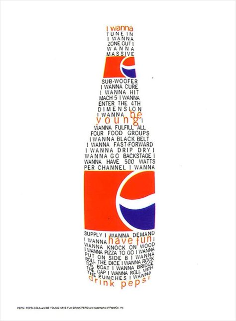
Here is a poster designed with classic Art Deco motifs, including the “sunburst”, decorative lines, and gold as a central color.

Design styles sometimes encompass many mediums of culture. Here is an example of a lamp made during the height of Art Deco popularity.

Since this style holds historic and luxurious connotations, a business could utilize its classic pin-striping or ornate decorations of the era to convey a feeling of emerging luxury.
Lately minimalism has taken center stage in the design community, especially for digital media. Minimalism is a visual style that emphasizes only the most important information, striping all unnecessary elements. Its rise in popularity is due to its usefulness in communicating things quickly in a digital setting. Digital minimalism began as a reaction to the early digital design trends of the 90s and early 2000s. As digital scanning, manipulation, and production became easier, many designers decided to use these new capabilities to their fullest potential.
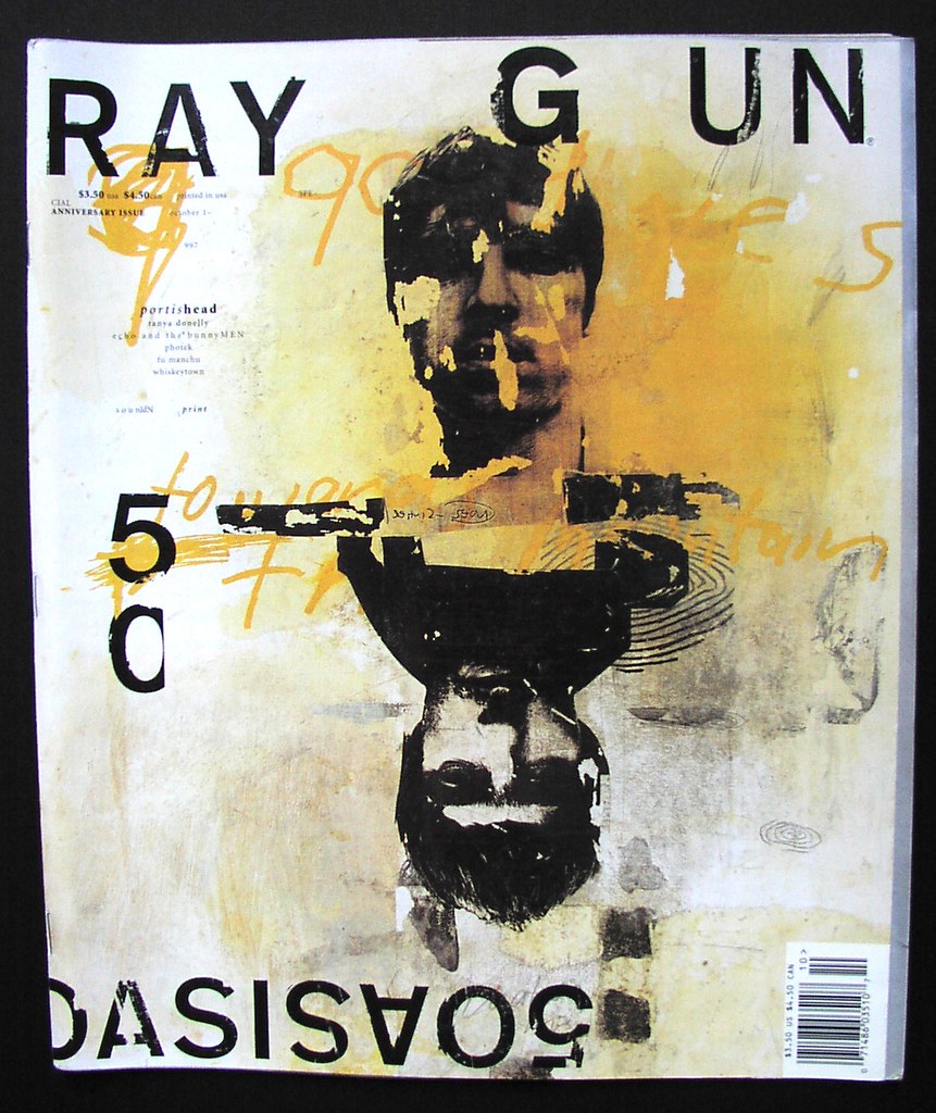
This produced designers like David Carson, who uses texture, type, and color, fully. Taking advantage of digital techniques and being influenced by the early cluttered skateboarding aesthetic, Carson developed a visually busy style.
This trend grew out of control and people realized it was difficult to communicate effectively within this style, let alone try to navigate a webpage designed this way. As viewing devices got smaller, web navigation needed to be simple and intuitive. Most digital designers moved to the opposite extreme and stripped from their work everything but the essentials needed to communicate their message.
Today most website’s use minimalist principles to communicate efficiently. Here is the website of a web designer MIXD.
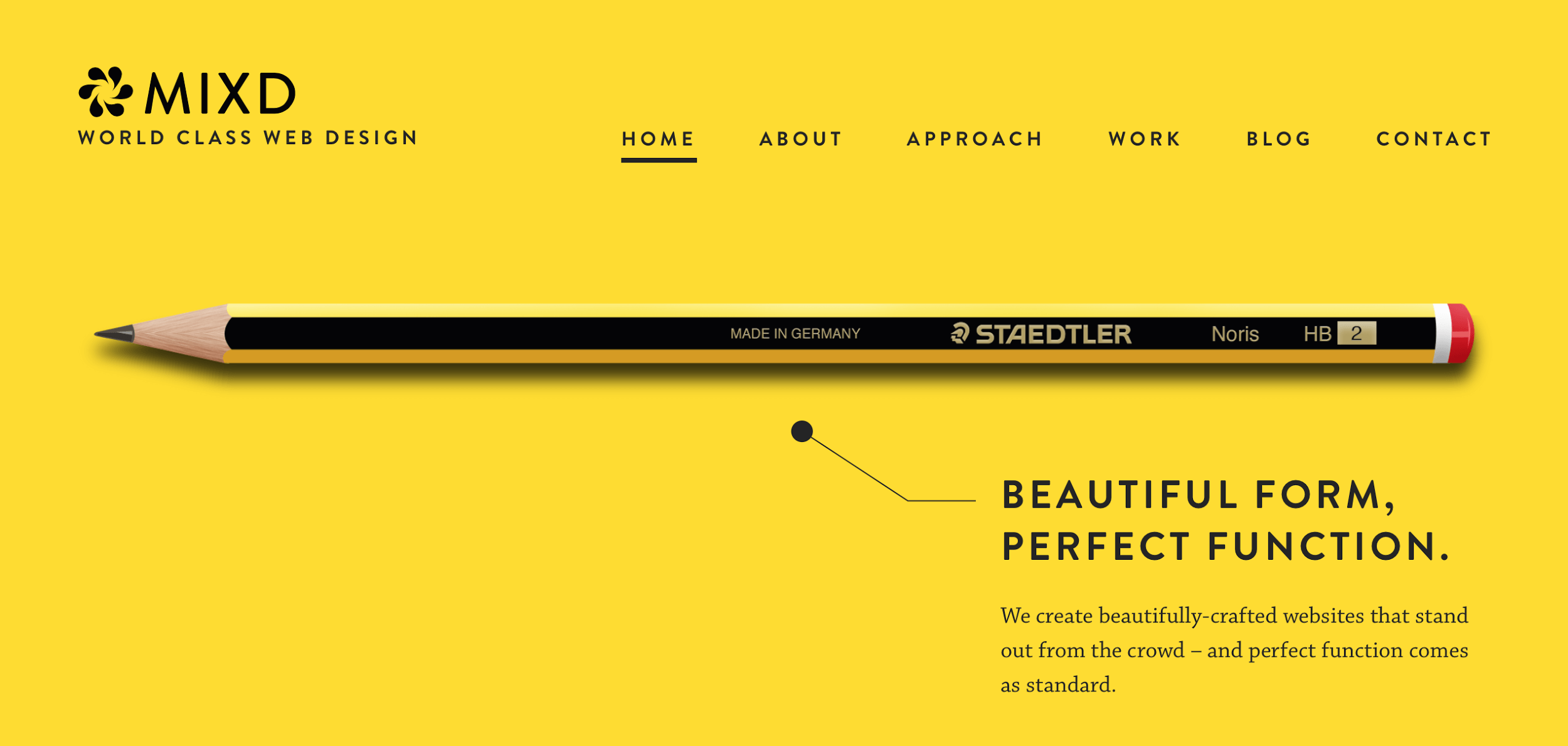
The page uses negative space to attract attention to the few elements. The small amount of text is easy to read, and effectively conveys what the business offers. If the composition was required to shrink due to a smaller viewing device, the small amount of elements could be easily rearranged.
Unfortunately many people assume that designers build brands based on what looks nice, when there is actually an incredibly in-depth process that accompanies it. Utilizing visual styles to effectively communicate your brand will yield the best results. Viewers will be able to identify the desired emotions and connotations that your brand wishes to evoke. The visual semantics will be already learned and any meaning easily conveyed.