No, I'm not trying to encourage a solitaire habit. We're talking about something called a card sort task, which can be a great tool to help figure out how to set up the navigation on your site.
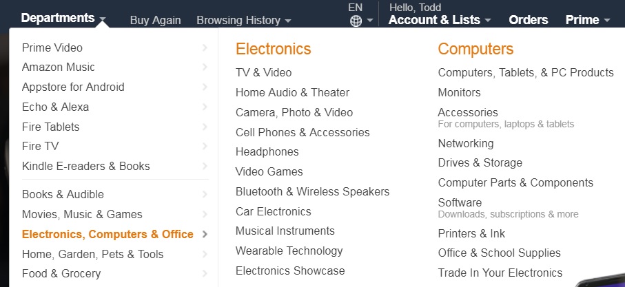
The point of having a navigation system is to help users easily locate the content they are looking for. If your site only has a few pages, you may be able to get away with a few navigation links at the top of your page. But as the number of pages grows, you soon run out of space for links, and have to make use of sub-menus, or even sub-submenus, like in this example from Amazon.com:
But how should you organize pages into menus so that they're easy for users to find? You may think 'potato chips' and 'hot dog buns' go together, but your users may think 'potato chips' should go with 'pretzels'. A card sort task helps you figure out the best way to organize your menus so that they will make sense to users.
Here's how it works. You start by creating a list of all the pages on your site. If you haven't already done it, it will be useful to do this in the form of a sitemap, like this:
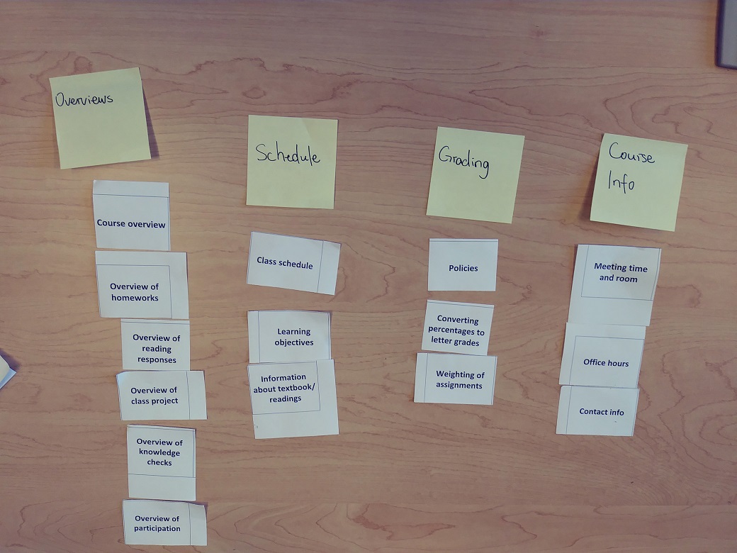
Now, write down the name of each page on a notecard. Shuffle the notecards, hand them to a user, and ask them to organize the cards into groups so that similar pages are grouped together. Once they've done this, give them a sticky note for each group, and ask them to label the groups with a word that describes what they all have in common. Here's what the result looks like:
Even getting the perspective of one person other than yourself can be useful, but for you to get the full benefit of this technique, it's best to get have several users do it. For the example being used here, 7 different users of the site sorted the cards. Of course, different users will sort the cards in different ways, so how do you use the results to actually design your menus? We use a statistical method called hierarchical agglomerative clustering (we're not making that up, Google it if you like!). This produces what's called a dendrogram, like the one below:
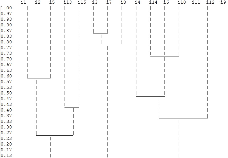
The dendrogram groups the most similar pages together, then the next most similar pages, and so on. In this case, we wanted four menus, so we looked for the place in the dendrogram where there were four groups left.
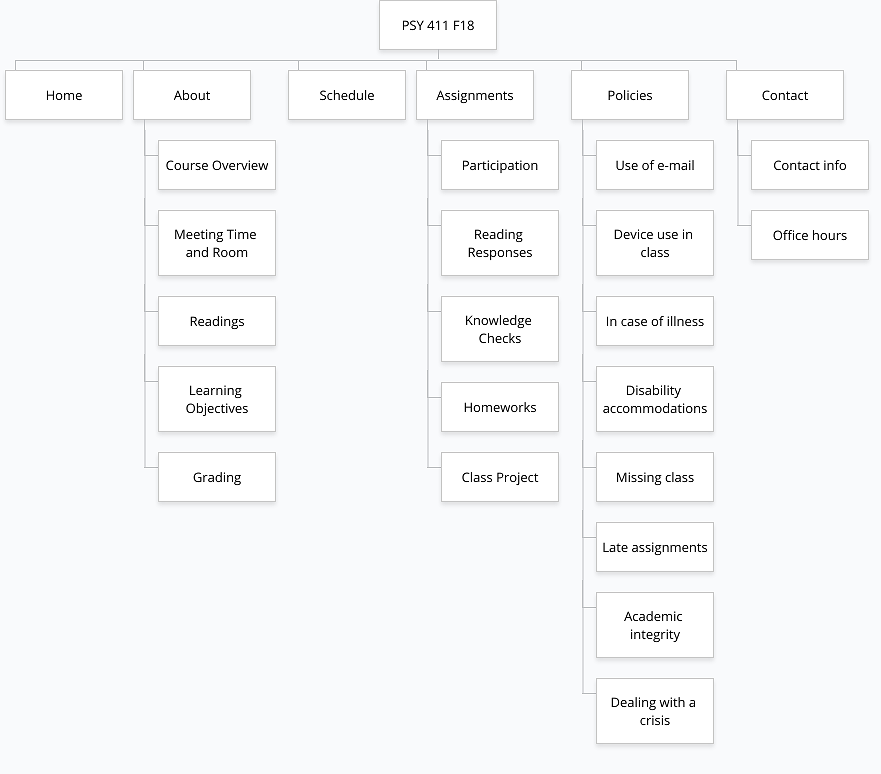
Because the dendrogram basically averages together the opinions of many different users, sometimes it can produce results that don't make sense (as a rough analogy, it's like trying to average together chicken and squash and getting ketchup). So, you still have to use your judgment, and not blindly follow the statistics (really, you should never blindly follow statistics anyway!). So after a few adjustments to what we got from the dendrogram, we arrived at this new menu structure:
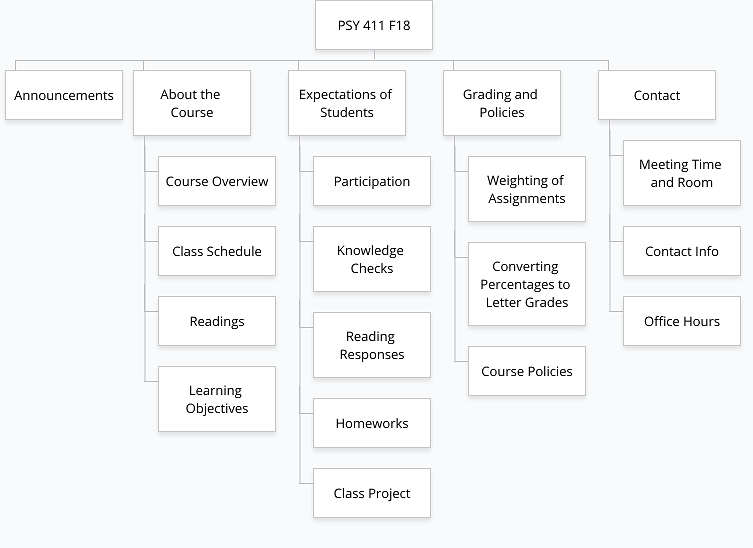
These new menus more closely reflect how the users of the site think about the content than the menus we started with, so they should make navigating the site simpler and easier!