Name and Design Survey
Because we take a design approach to our work, we often use simple, small-scale surveys to get some quick feedback that we can immediately apply to what we're working on. This is an example of that from a demonstration project we did a while back.
In this project we were helping to develop a web app aimed at college students participating in group projects. In the early stages of the project the app didn't have an official name, and a generic color scheme was used in the interface. But when the work turned from building the basic structure of the app to putting on the finishing touches, we had to start thinking about appearance as well as function.
Three candidate names had been selected:
- Projectiversity
- GroupUTopia
- TeamUDream
Our graphic designer came up with a mockup for each name, using that name as inspiration for choosing colors, fonts, and overall design style. Here are the three mockups.
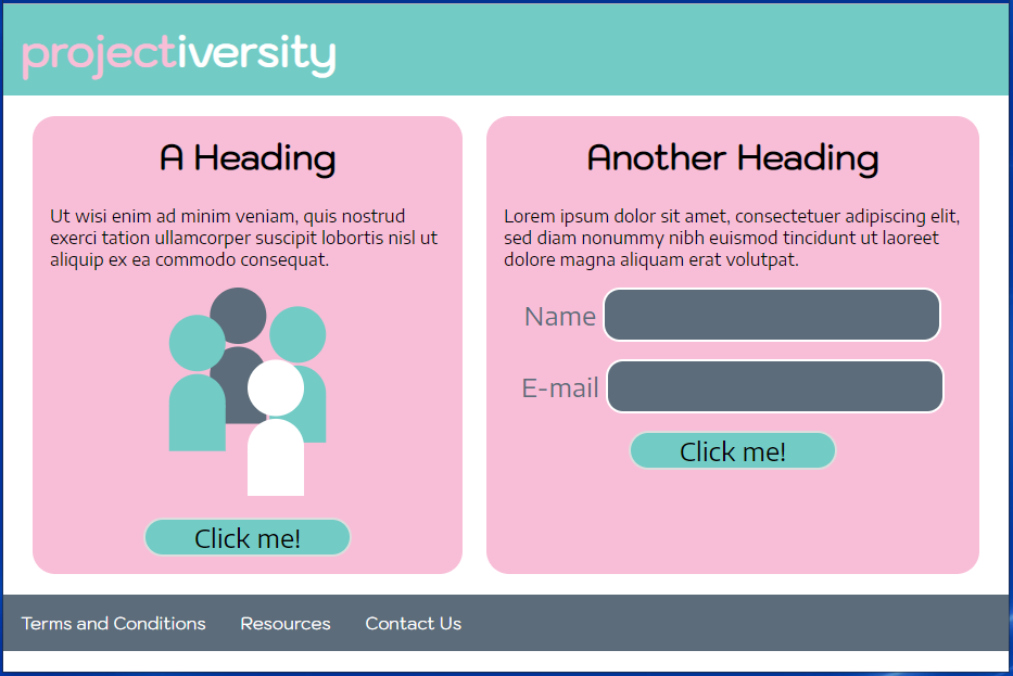
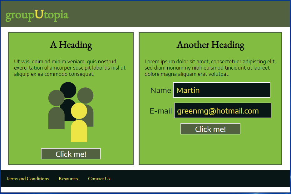
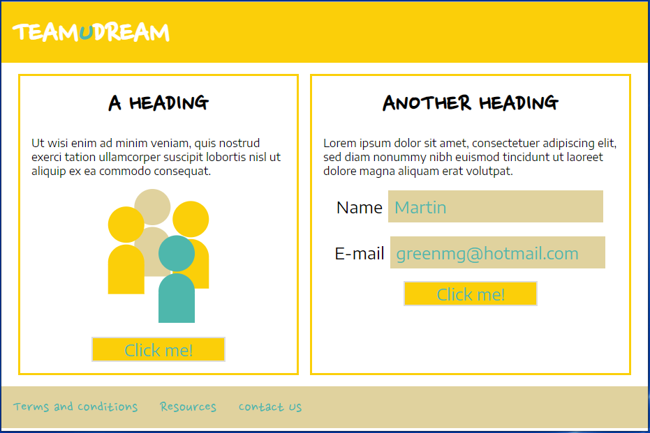
Rather than just evaluating them ourselves, we surveyed 30 people to see how they perceived the names and designs. The basic concept for the app was a tool for college students working on group projects that would make the process easier and more pleasant, so we asked respondents to pick the the name they thought fit best with each part of the concept (college students, group projects, easier and more pleasant). Here's what they told us:
| Projectiversity | GroupUTopia | TeamUDream | |
| College students | 66.7% | 20% | 13.3% |
| Group projects | 20% | 66.7% | 13.3% |
| Easy and pleasant | 23.3% | 63.3% | 13.3% |
Clearly, TeamUDream was out. Between Projectiversity and GroupUTopia, we decided that the group project part of the concept was more critical than the college student part, so we tentatively went with GroupUTopia.
We also asked which page design people liked the best, and why. The Projectiversity design came out slightly ahead of the GroupUTopia design. However, the really useful information came from looking at the reasons. Because the app was aimed at college students rather than businesspeople, our designer had made the designs bold and colorful, to avoid a "corporate" feel. Turns out the designs were a little too colorful - our respondents just found them distracting and hard on the eyes. The Projectiversity design was preferred because it had the softest colors, but respondents felt that the pink and blue triggered thoughts of baby girls and boys rather than college students. Our designer took the feedback and created a new color scheme that was easier on the eyes but still had some character.