Suppose your business is a retail store on the second floor of a building. There are stairs, but no elevator. The implications of this are pretty obvious. Anyone who can't climb stairs can't make it to your business. This is clearly bad. People who can't get to your business can't become your customers. Depending on the country you operate in and the size and nature of your business, you may be required by law to remove barriers for individuals with a disability. Even people who can climb the stairs may view you less positively if you don't seem to care about people with different needs.
The same factors all come into play on the web as well. However, while the lack of an elevator, ramp, or handicap parking is easy to see and understand, what makes a website accessible or non-accessible is not always so visible or intuitive. Furthermore, there's a lot more gray area - accessibility on the web falls on a continuum, from highly accessible to very non-accessible, with about 100 different degrees of accessibility in between. And finally, there is often a tension between what makes a website accessible and what makes it look trendy and artistic. This can all seem overwhelming, and you might be tempted to just hand it all off to your web designer to take care of.
Although you may well need a web designer to handle the technical details, disengaging from this issue altogether would be a mistake. To understand why, you might take a few minutes to watch this TED talk by Elise Roy on designing for disability. Roy's central point is this. Obstacles for people with disabilities are often obstacles for everyone else as well. It's just that a disability can magnify the impact of that obstacle, thereby making us aware of it. When we remove the obstacle, we actually benefit everyone. In this way, thinking about the needs of people with disabilities can help us innovate and come up with better solutions in general.
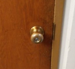
A classic example of this is door handles. In the U.S., a lot of older buildings have door knobs like this one:
But any newer public building has lever handles, like this one:

The shift was due in large part to the Americans with Disabilities Act (ADA), passed in 1990. That law requires, among other things, that not more than 5 pounds of force is needed to open a door, and that the mechanism not require tight grasping or twisting. These requirements make things easier for, say, the elderly, or people with arthritis. But they also make things easier for an able-bodied 25-year-old carrying a baby or a bag of groceries. Levers are just plain easier to use.
Of course, the ADA didn't drive the development of lever door handles. It just led to their widespread adoption. But that widespread adoption led to innovation, in ways you may not have realized. As discussed in this article on types of door locks, although lever door handles are easier to use, it's also easier to force the handle and break the lock. That problem had always been there, but it suddenly applied to a lot more doors, spurring innovations to address it. One such innovation is the clutched lever. Clutched levers will still move when the door is locked, they just won't pull back the latch. A clutched lever handle is both easier to use and more secure than a conventional doorknob - a better design solution all around.
When it comes to a website, the main disability that needs to be considered is a vision impairment. The number of people with such an impairment is large - 10% of American adults have some amount of vision loss. Vision impairments take several forms. People with color blindness may have difficulty using color cues on your site. People with low vision may struggle with text that is too small or doesn't have enough contrast. A legally blind person using a screen reader benefits from alternative text for pictures, as well as clear, descriptive text for your links.
By all means, you should address those specific issues. As a starting place, here is a short and simple blog post with suggestions on accessible design for a blog. But you'll end up with a better website overall if you treat those needs not as isolated problems for a subset of your users but as a source of inspiration for building a better website for everyone.
This post is the first in a series where we aim to help you do just that, using the organization of information on a page as our main focus. In our next post, we'll start by approaching things from the perspective of a sighted person, and discuss the idea of a visual hierarchy. Visual hierarchy is one solution to the problem of guiding users through the information on a page, but it doesn't work well for all users. However, we think that by considering other ways to guide users, you'll actually get better at using visual hierarchy as well, thus benefitting everyone.